
 For this blog post I thoroughly enjoyed using Flourish which has become my favorite data visualization tool to create interactive graphics. With this software I used the dataset from 1790 – 1850 that you provided in the attached PDF. After analyzing the multiple excel charts I narrowed down my selection to the time period of the year 1800. During this time slavery was very much in its peak and was thriving off of able black bodies. As I was looking at 1800 census data I noticed a discrepancy in the numbers of enslaved versus freed depending on the state.
The research question I came up with is: “What was the population makeup of Northern vs Southern states in the height of slavery? What is the chance of running into a free person versus an enslaved person in the year 1800?”
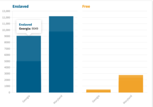
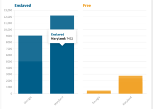
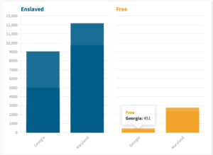
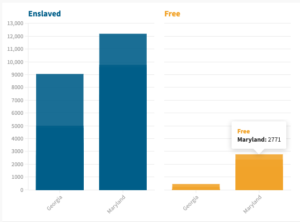
I took specific columns of data from the year 1800 and exported the data into a different Excel spreadsheet. The columns that I selected were from states in different territories of the United States; specifically the Northern state of Maryland and the Southern state of Georgia. I also copied and pasted the data into different columns of the enslaved people, and the freed people in both of the states. After this data was properly sorted I exported it into Flourish.
The first column, column A shows the year. The second column, column B shows the state. The third column, column C shows the enslaved people. Lastly the fourth column, column D shows the freed people. At first I used the default template, but after exploringFlourish features I adjusted the setting to end up with a column chart(grouped) for my data visualization. The column charts in my opinion was a good way to show change over time, and it is visually easier to compare column lengths. The only other chart I think that would visually represent the data properly is using a Bar chart. The bar chart is another effective way to compare data sets between different groups. The bar chart is also visually easy to interpret.
After looking and analyzing the four charts it was interesting to see how Georgias 5,000s enslaved people to Georgias 451 freed people had a ratio of 20:1. Basically before the abolition it was highly unlikely to see a freed person in the South. When we analyze Maryland charts we see 7,432 enslaved people to Marylands 2,771. The ratio is 1 freed person to 4 enslaved people. Basically in the Northern states it was more likely cross path with a freed African American.
I’m so glad to hear that you enjoyed Flourish so much! I agree that it is one of the most versatile tools that can be used with all kinds of data. I also enjoyed reading about your workflow for creating the visualization and your interpretations once the data was uploaded into Flourish. I think this data begins to offer some insight into your research question on the numbers of enslaved-free populations and the differences in places like Georgia and Maryland. I also agree that the column graph was a good decision for representing this data– it is clear and easy to read. Thank you for sharing this fantastic visualizations and interpretations!