
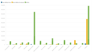
For my research question, I wanted to analyze the distribution of population and slavery in each state in 1790. I chose 1790 because I thought it would be interesting to examine how widespread slavery was in young America, as it was beginning to organize itself as an independent nation and before slavery became such a contentious issue on the national political platform. My experience interpreting this data with Flourish was relatively easy, as the data itself was very easy to comprehend and Flourish was a great and simple tool to select the variables I wanted to interpret and put them into a bar chart. I decided the best way to interpret the data was to separate by state and then look at the total population of white, free non-white, and enslaved non-white people living in each state. I believe a bar chart was the best way to interpret this data because looking at 14 separate pie charts would not be easy on the eyes, and would not be able to compare the raw totals of each state the way a bar chart would be able to with every state on one graph. The bar chart helps to be able to compare those raw totals as well as the proportions of the three categories I chose within each state and in relation to other states. While a pie chart could have worked if I was only concerned with the proportions of white to free non-white to enslaved non-white people, I thought that the aggregate totals would be important to view for each state as well, so I decided a bar graph would be the best choice. All in all, I think that Flourish is both very informative in the way it presents and displays data, as well as very simple and easy to use.
Fantastic data visualization and analysis! I am glad that you enjoyed the process of building it in Flourish and found this experience to be informative. Your column graph (vertical bar graph) clearly reflects the different categories you chose to represent, and certainly visualizes an answer to your research question. I agree that this graph was a better decision to view all of your data, rather than dividing them into pie charts. Excellent work on this visualization and discussion of your observations!